Web Design
Web Sites
To view design flows and prototypes please click the “View My Work Here” link at the bottom of the page within the Wireframe and Prototype box.
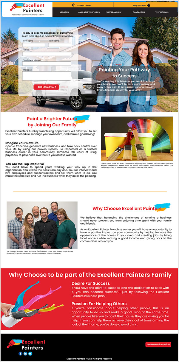
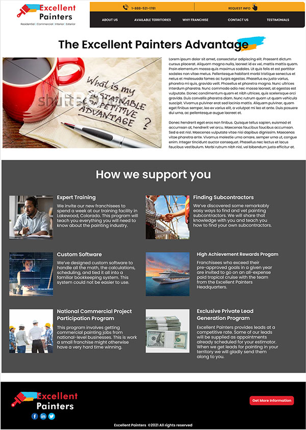
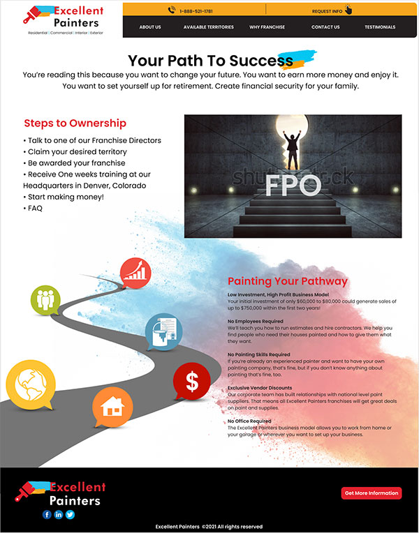
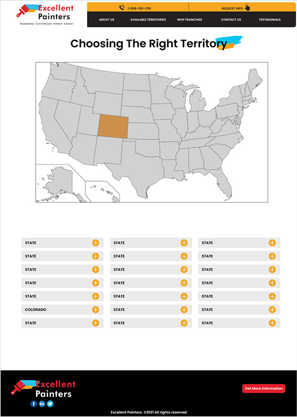
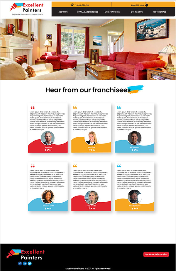
Excellent Painters Franchise web site design
Case Study
Excellent Client: GetYourQuote/Excellent Painters
Purpose: New site design for Franchisees
Description: This was a fresh start for a start up company called Excellent Painters. The site was designed for the purpose of gaining potential franchisees or individuals interested in purchasing an Excellent Painters Franchise. Above I’ve included some of the pages I designed which I felt stood out the most. Should you wish to see the prototypes associated with this site please click here. The five pages included above portrayed five unique designs that still maintained the brand consistency of Excellent Painters and kept the flow of the franchise site.
Result: The site was completed, however it never went live. The parent company of GetYourQuote, LLC redirected their business efforts away from franchising and on to a more sales/lead generation business model.
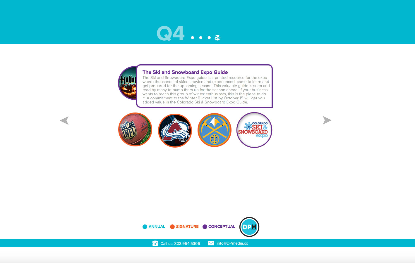
Quarterly Calendar Special Sections Web Site
Case Study
Client: The Denver Post
Purpose: Special Sections Website
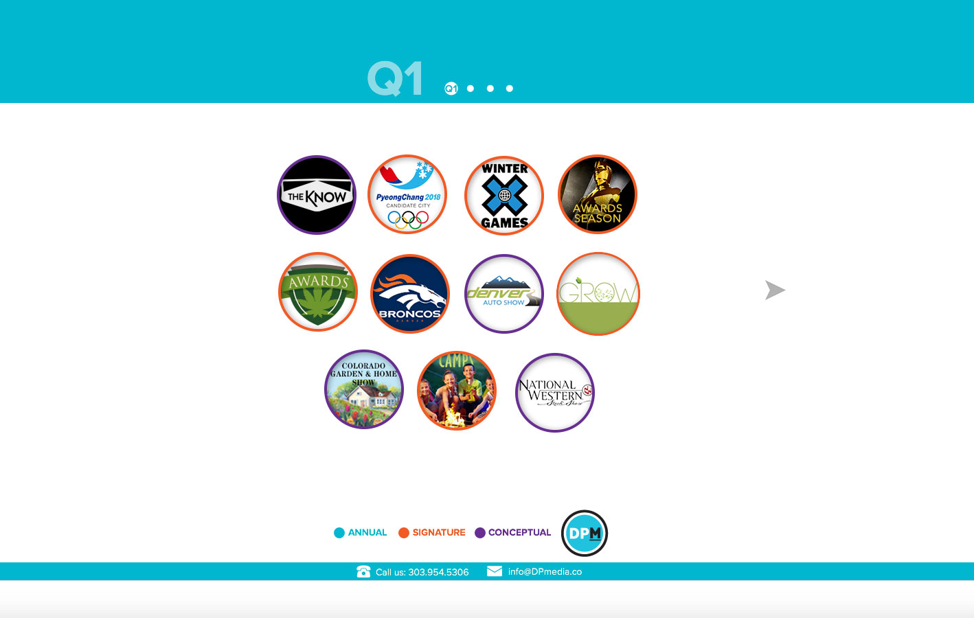
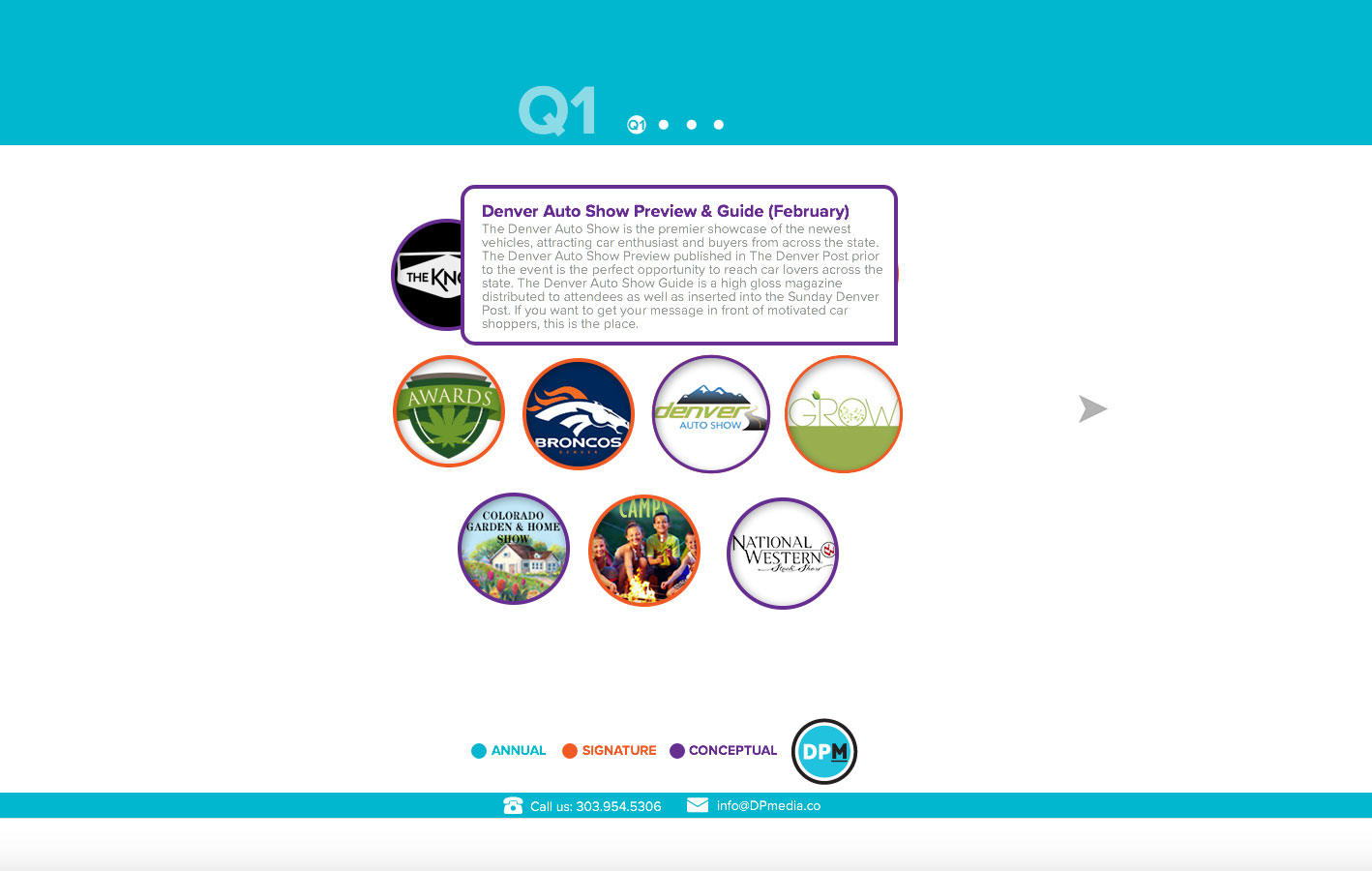
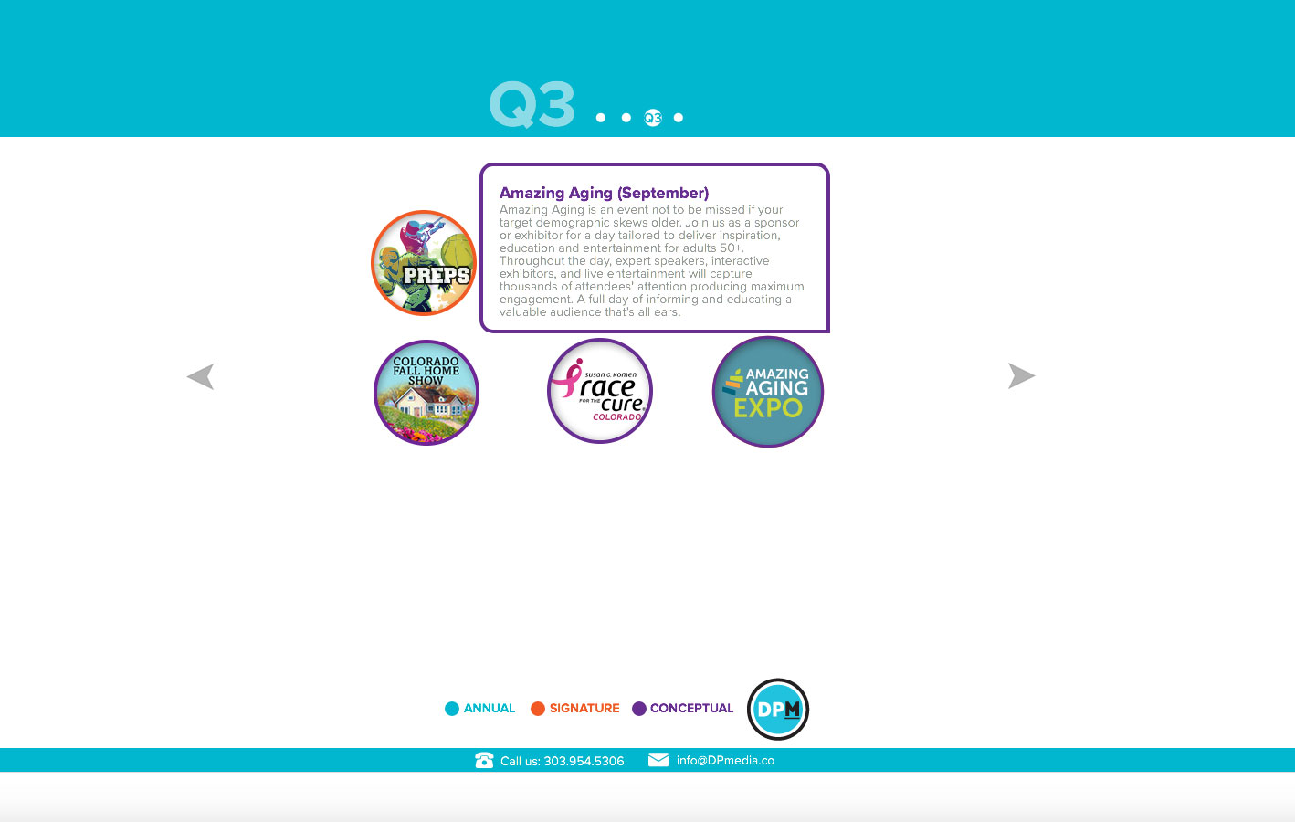
Description: This was a functional design to help sales track special sections and events by Quarter. Each event is set to “rollover” and provide additional information regarding said event or sales section. I designed each rollover button and wrote the copy for each as well as built the website in it’s entirety. Additionally, there are four buttons at the bottom that povide an outline view of the upcoming year, special “signature” sections, Conceptional (or upcoming events or sections that are still in the planning stage or proposal state), and a final button to link directly to The Denver Post online news site.
I was in charge of keeping this updated and maintained as well.
I placed this here not only to provide web content but I was also instrumental in providing a vast majority of the promotional material and webcontent of each of the Quarterly Events and Sections provided.
Result: By rolling over each icon both sales and management could track what was in the upcoming pipeline. The complete site can be viewed here.
Micro Sites
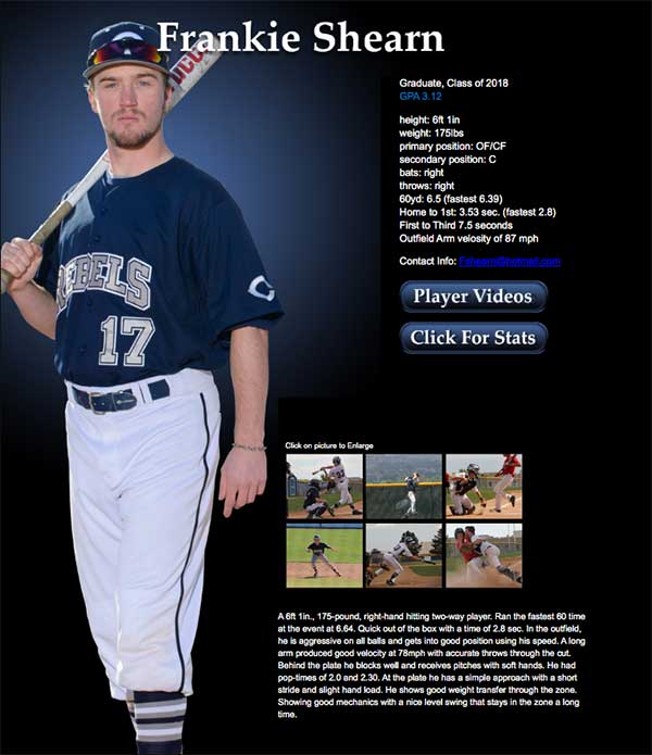
Columbine Baseball Micro Recruiting Site
Case Study
Client: Columbine Baseball
Purpose: To aid in the recruitment efforts of High School Athletes
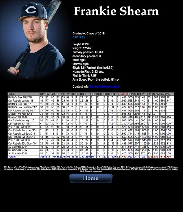
Description: This was a personal effort to build awareness to High School Baseball players whose ambition is to go on to play College baseball. It is a three page site that includes many interactive elements. The home page has linking images as well as links to both the second (Stats page) and Third (Video) pages.
Result: Player featured went on to play Division Two Baseball
Creation of the site required shot video and editing, as well as Excel documents that held funtions that calculated player stats. The micro site can be viewed here.
Landing Pages
Case Study
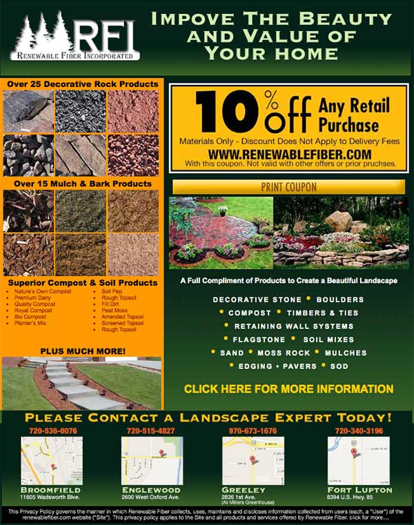
Client: RFI (Renewable Fiber incorporated)
Purpose: Landing page to serve as a go-between while adjusting their main-site.
Description: Built as a “pausing point” until they reworked their site, this landing page was built functionally to link toward their services, provide a printable coupon, provide links to RFI’s other locations and track traffic to their main site.
We designed this landing page to function very closely to a mini site. But chose not to include a navigation bar. You can view the landing page in online here.
Case Study
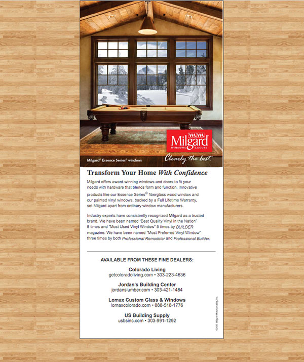
Client: Milgard Windows and Doors
Purpose: This was designed as an online “Advertisement/Landing page” to promote their services.
Description: At the time this was built the customer didn’t want it to track back to their website wanting only to be able to track the phone calls to their different locations. As such this has no CTA and no direct links.
You can view the landing page in online here.
Mobile Landing Pages
Case Study
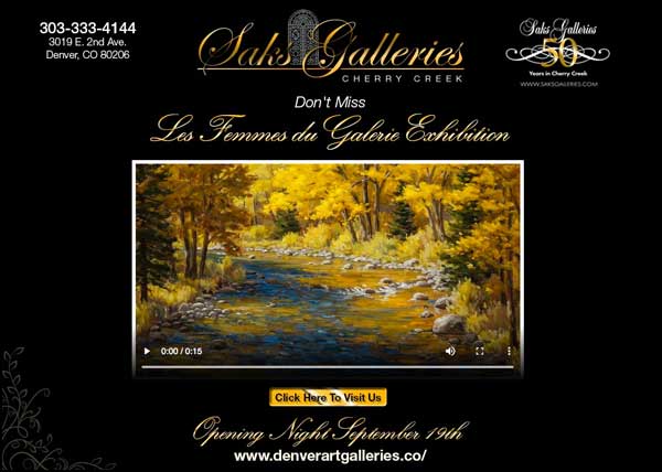
Client: Saks Galleries Cherry Creek
Purpose: Mobile Landing page intended to bring awareness to Saks and their 50th anniversary in Cherry Creek.
Description: I built this landing page to not only have an elegant look, that would also highlight one of the many beautiful paintings they house in their gallery, but it also incorporates three different rich media elements.
The first is the CTA or call to action, which upon clicking takes you to their web site, second it was built for the ipad or tablet and third, it incorporates video. Clicking on the video player plays a short promotional video they supplied. Click Here to view the actual landing page.
Wireframe and Prototype
Every project has a starting and end state. With careful planning and detailed organization many of the “hickups” in the final design process can be eliminated.

